Blog and News > marketing > What I learned this week: landing page wizardry!
What I learned this week: landing page wizardry!
Hello everyone! As the image may have given away, you’ve found another Jasmine blog. And this week, I’ve been compiling data about every landing page CANDDi has ever used.
The plan was to help optimize the copy for a new campaign we’re planning to run, but in the process I noticed some interesting patterns about what works and what didn’t.
It’s easy to assume that as long as you have a nice, professional page with enough information on it, people will convert… which is why I was surprised that some of our uglier-looking landing pages actually had the best conversion rates.
I also found that there were 3 major things all of our most successful landing pages had in common… so I thought I’d share them in this blog post!

Keep it Simple, Stupid
Be honest, how many times have you seen a page with exciting buzzwords on it but had no idea what the business actually sold?
Some of our old landing pages were almost exclusively made up of phrases like “turbo-charge your business!” and “revolutionize your sales team”. When I compare those to our recent, more simply worded pages (which convert way better, by the way) the difference is stark.
See, headlines like “Industry-Leading 360-Degree Solution Driving Fantastic Results” achieve nothing. It looks impressive, sure… but so does juggling. And I’ve yet to buy anything from a juggler.
However complex your product or service, you should aim to distill it down to its most crucial benefits, and lead with that on your landing page. The purpose of the copy isn’t to convey every little nuance of what you’re selling… it’s to convey its value.
As Albert Einstein once said: “If you can’t explain it simply, you don’t understand it well enough”.
Segment your prospects for laser-targeted copy
So we’ve spoken about the importance of showing your visitors the most crucial benefits of your product, but what if the use-case of your prospects isn’t always the same?
That’s why it’s a good idea to segment your prospects. Create separate landing pages for different use-cases.
Take us, for example. Historically, our landing pages which aimed to convey EVERY benefit of CANDDi for a broad audience haven’t converted that well.
Conversely, our landing pages which focus on one use-case (say, businesses who do a lot of email marketing who want to convert more of their click-throughs) the conversion rate is significantly higher.
Personalization
There’s that P-word again.
You may have noticed I was also banging on about personalization a few weeks ago in my blog about videos.
There’s a reason for that: it works!
Because CANDDi identifies information about visitors, and recognizes them when they come back, we can create landing pages that change for every visitor.
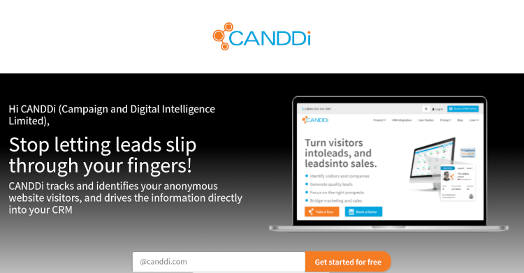
The image above shows a cool example of this. Both the welcome message (Hi CANDDi) and the image on the laptop change to match the visitor’s own business name and website.
It’s a really clever technique that gets people’s attention instantly.
We tested this landing page against an identical one but with generic images and copy, and the personalized page had got over twice the amount of conversions.
Before you ask how you can get personalized landing pages… we’re ironing out all the kinks with this technology as we speak. As soon as it’s ready, we’re planning on letting our users pull off this same landing page wizardry on their own websites.
So watch this space!
If you’d like to try CANDDi out for free, sign up for our one-month free trial here!