Blog and News > marketing > How to use burndown charts to improve your sprints
How to use burndown charts to improve your sprints
We’ve spoken in many blog posts about how CANDDi’s marketing team has benefitted from working in focused iterations, or “sprints”. In this post, we’ll take a look at a tool we’ve found has really helped us analyze our performance in these sprints: the burndown chart. Burndown charts make use of your scrum team’s inputs during planning meetings, so it’s a good idea to first read our blog on how to plan sprints with military precision if you haven’t already.
What is a burndown chart?
A burndown chart is a visual representation of your sprint velocity. In simple terms, it shows how much work has been completed, and how quickly.
There are two lines plotted on the burndown chart. The first is a projected ideal for the work completion; it shows what it would look like if you had a scrum team of robots who worked through tasks at a perfectly consistent rate.
The second line represents the rate at which work is actually completed. If this line is above the projected ideal, it means work was completed slower than projected. If the line is below, the work was completed faster.
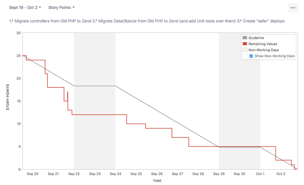
Burndown charts are such a valuable tool because of the wealth of information they offer at a glance. Anyone can look at a sprint’s burndown chart and get a solid impression of how things are going - or how they went.
How the burndown chart is calculated
In a previous blog post, we discussed how important it is to score every task during sprint planning meetings.
This number represents complexity; some scrum teams choose to assign each task with an estimated number of days, while for others the number simply denotes an agreed-upon level of effort and difficulty.
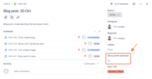
These scores inform the Burndown chart; completing a task with a ‘1’ difficulty will have less impact on the chart than completing a ‘5’, for example. It’s also how the projected ideal is calculated - the gray line on the chart simply shows the sprint’s total number of points divided by the number of days your team has to complete them.
How to best use your Burndown chart
During the sprint, the burndown chart is a great way to get a snapshot of your progress. It can be used to detect any problems or underperformance early on, giving plenty of time for a course correction before the deadline.
After the sprint, the burndown chart becomes a fantastic tool for the retrospective. Any conversations about successes and failures are enriched by the burndown chart, which offers an easy-to-understand summary of the entire sprint.
It’s all very well and good to sit around a table after every sprint to discuss performance in vague terms, but in order to really achieve the iterative improvement intended by the scrum process, metrics like the burndown chart are a necessity. By tracking and comparing the data of past iterations, your scrum team can refine their approach to work in a meaningful, quantifiable fashion.
Things to keep in mind
There are a couple of things be aware of, before vowing to live and die by the burndown chart.
The first is that it only updates once tasks are completely ‘done-done’ - you can read our blog post on what this means here - which is worth remembering when trying to gauge progress.
Because of this, there will often be entire days where the burndown line does not progress. Don’t panic! This likely just means that those days were spent working through larger tasks with lengthy subtickets.
Finally, it’s important not to stress too much about those red and gray lines. There will always be tough sprints, but even in these situations, you should view the burndown chart as a tool for learning rather than a visual representation of failure.
As mentioned, paying no attention to a burndown chart is a wasted opportunity for growth. When paying too much attention to the burndown chart, however, scrum teams may begin to rush their work or under-commit during planning meetings, just to keep up with the projected ideal.
As long as you keep these small caveats in mind, the burndown chart can be immensely useful. It’s one of the many ways we’ve managed to create a more intelligent work process for our marketing team at CANDDi, and we’d love to hear about your experiences with it too!